Analis Architects
 Jovanus Hartono

On this page
Analis Architects is an architecture and interiors studio, and this is its portfolio site. The home page opens on a full-screen carousel of the studio's projects, with a strip of project videos further down. The works page puts every project in a grid you can filter. Each project gets a page of its own, with a row of photos that scrolls by itself, a list of the project's details and a write-up, and a gallery page puts every photo in one place.
The studio adds and edits all of it themselves, in a Payload CMS admin that runs inside the same Next.js app as the site.
I'd tried Payload once before, on Ricaleen Metal, and backed off, because I'd have had to learn its docs and syntax before building anything. This time I had the time to learn it, and Payload 3 was built around Next.js.
Payload inside Next
The public site and the admin are two route groups in one app, (frontend) and (payload). A folder name in brackets groups pages without adding to the URL, so each half gets its own root layout. Content lives in Postgres through Payload's Vercel Postgres adapter, and photos and videos go to Vercel Blob.
My favourite part is how pages read content. They call Payload's local API, which is a plain function call in the same process:
const {
  docs: [project],
} = await payload.find({
  collection: "architectures",
  where: { slug: { equals: slug } },
  limit: 1,
});
There's no HTTP request, no API key and no webhook in between.
An admin made of config
Payload builds the admin from the same config that defines the data. A project is a Payload's word for a kind of document, like a database table with its own admin screen., a list of fields, and each field's type decides what the studio gets in the form:
| Field type | In the form |
|---|---|
relationship | A picker, with a button to add a new project type on the spot |
radio | A row of statuses, from Conceptual Design to Completed |
upload with hasMany | A list of photos you can drag into order |
Layout is config too: a row puts Project Type, Year and Award side by side, and position: "sidebar" moves the slug and the video to the right. Here's a slice of it:
{
  type: "row",
  fields: [
    { name: "projectType", type: "relationship", relationTo: "project-types", required: true },
    { name: "year", type: "number", required: true },
    { name: "award", type: "text" },
  ],
},
{
  name: "status",
  type: "radio",
  defaultValue: "conceptual",
  options: [
    { label: "Conceptual Design", value: "conceptual" },
    { label: "In-Preparation", value: "in_preparation" },
    { label: "Under Construction", value: "under_construction" },
    { label: "Completed", value: "completed" },
  ],
},
And this is the form it turns into:
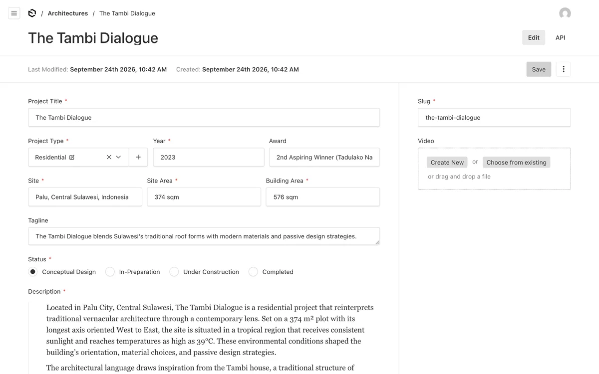
The slug fills itself in. A small hook on the field turns the title into a slug when it's left empty, so "The Tambi Dialogue" becomes the-tambi-dialogue:
hooks: {
  beforeChange: [
    ({ value, data }) => (!value && data?.name ? formatSlug(data.name) : value),
  ],
},
A gallery block for the write-ups
The write-up on each project page is Payload's rich text, edited in Lexical, the text editor Payload builds on. Out of the box it has what you'd expect from a text editor, like headings, lists, links and quotes. Payload also lets you add your own A reusable group of fields that an editor can drop into the text, like a gallery or a quote card. to it, with its BlocksFeature, and I added one: a gallery, a row of photos or drawings sitting between two paragraphs.
It's still the part of this project that amazes me most, because of how little of it I had to write. Here's the whole block:
export const GalleryBlock: Block = {
  slug: "gallery",
  interfaceName: "GalleryBlock",
  fields: [
    {
      name: "gallery",
      type: "upload",
      hasMany: true,
      required: true,
      relationTo: "media",
    },
  ],
};
And here's the editor being told about it:
editor: lexicalEditor({
  features: ({ defaultFeatures }) => [
    ...defaultFeatures,
    BlocksFeature({ blocks: [GalleryBlock] }),
  ],
}),
That was everything the admin needed. Type a slash in a write-up, and Gallery is at the top of the menu, under Blocks. Pick it, and a card appears in the text with the same photo picker as any other upload field, so the studio can upload new photos, choose ones already in the library and drag them into order. Four of the studio's architecture write-ups have one now.
Payload saves the block inside the write-up's JSON, as a node that holds the chosen photos. And because the block has an interfaceName, Payload generates a GalleryBlock type for it in payload-types.ts.
On the site, the write-up used to be turned into an HTML string with convertLexicalToHTML and injected into the page. An HTML string can't hold a carousel you drag, so I switched to Payload's React renderer, RichText, which takes a converter for each kind of node. The default converters handle paragraphs, headings and the rest, and I added one for gallery blocks:
type NodeTypes = DefaultNodeTypes | SerializedBlockNode<GalleryBlockType>;

export const jsxConverters: JSXConvertersFunction<NodeTypes> = ({
  defaultConverters,
}) => ({
  ...defaultConverters,
  blocks: {
    gallery: ({ node }) => <GalleryBlock {...node.fields} />,
  },
});
The generated type goes straight into NodeTypes, so node.fields arrives already typed as the block the studio filled in.
GalleryBlock itself is a small client component: an Embla carousel you can drag freely, with a square crop of each photo. Tapping a photo opens it in the lightbox, the same <dialog> that the row of photos at the top of the page uses. That dialog used to live inside the photo row, so to share it I moved it into a A React wrapper that hands the same thing to every component inside it, without passing it down by hand. around the whole site. Now anything can open a photo in it.
Photos
The rest of the admin work is mostly about photos. The admin uploads files from the browser straight to Blob, so a big photo never has to squeeze through the 4.5 MB request limit on a Vercel function. Payload stores each file's public Blob URL, so images load from Blob directly instead of streaming through Payload. next/image then serves AVIF or WebP, caches the result for about a year, and allows widths up to 2560px and quality 100 for the full-width photos on the home page.
Cards that know where they were
The works page shows every project in a A grid of columns where each card keeps its own height, so the cards stack like bricks instead of lining up in rows., three columns wide on a big screen, built with CSS columns. Above it, a Filter button opens two rows of options: scope, for interior or architecture, and project type, for commercial or residential.
Every part of that page moves a little, and all of it is GSAP. Each animation runs inside useGSAP, GSAP's hook for React. It scopes selectors like .work-item to the component's own container, and it reverts every GSAP's word for one animation: some properties moving from one value to another over time. when the component unmounts, so nothing keeps running after you leave the page.
When the page loads, every card starts invisible, and GSAP fades them in one after another, 0.08 seconds apart. Opening the filter is a small sequence of its own. The panel grows from nothing to its natural height, the two row labels fade in, and then the options fade in one at a time:
gsap.to(filterRef.current, {
  autoAlpha: 1,
  height: "auto",
  duration: 0.5,
  ease: "power4.out",
});

gsap
  .timeline()
  .to(filterQuery("p"), { autoAlpha: 1, duration: 0.3 })
  .to(filterQuery("button"), { autoAlpha: 1, duration: 0.3, stagger: 0.07 });
autoAlpha is GSAP's shortcut for opacity plus visibility: at zero the element is also hidden, so an invisible option can't be clicked. A timeline plays its steps one after another, and stagger: 0.07 starts each button 0.07 seconds after the one before it.
Closing it shrinks the panel back to zero. Before either one starts, any tween still running on the panel is killed, so opening and closing it quickly doesn't pile animations on top of each other.
The filter itself was the fun part. Changing it reshuffles the whole grid: some cards disappear, and the rest land in different columns and rows. CSS can't animate that, because a card's position isn't a property anyone sets. It's wherever the columns happen to put it.
GSAP's Flip plugin gets around that with a trick named after its steps (Paul Lewis explains the technique well):
- First. Record where everything is.
- Last. Make the change, and see where everything lands.
- Invert. Move each element back to where it was with a transform, so nothing seems to have moved yet.
- Play. Animate those transforms back to zero.
function handleFilterChange(key: FilterKey, value: string) {
  const state = Flip.getState(q(".work-item"));
  setActiveFilters((af) => ({ ...af, [key]: value }));

  requestAnimationFrame(() => {
    Flip.from(state, {
      duration: 0.5,
      stagger: 0.08,
      absolute: true,
      scale: true,
      onEnter: (elements) =>
        gsap.fromTo(
          elements,
          { scale: 0.9, autoAlpha: 0 },
          { autoAlpha: 1, scale: 1, delay: 0.2, duration: 0.3 }
        ),
      onLeave: (elements) =>
        gsap.to(elements, { autoAlpha: 0, scale: 0.9, duration: 0.3 }),
    });
  });
}
Flip.getState runs before the state update, while every card is still in its old place. The update hides the cards that don't match with display: none. requestAnimationFrame waits for the next frame, by which point React has put the new layout on the page, and Flip.from does the invert and the play.
absolute: true takes the cards out of the columns while they move, so the columns don't reflow underneath them halfway through. stagger sends them off 0.08 seconds apart, which is what gives the grid its ripple. Cards that come back grow in from 90% after a short delay, and the ones on their way out shrink and fade.
A strip that scrolls sideways
The home page has a strip of the projects that come with a video, each one a video beside its details. On a wide screen, when the strip reaches the top, it pins under the header, and scrolling down slides it to the left until the last project is in view. Then the page carries on. That's ScrollTrigger, which ties an animation to the scroll position:
gsap.to(figures, {
  xPercent: -80 * (figures.length - 1),
  ease: "none",
  scrollTrigger: {
    trigger: sectionRef.current,
    start: "top 72px",
    end: `+=${sectionRef.current.offsetWidth}`,
    pin: true,
    scrub: 1,
  },
});
Each project takes up 80% of the strip's width, so moving every one left by 80% for each project after the first brings the last one into view. start: "top 72px" pins the strip right under the 72-pixel header, and the pin lasts for one strip's width of scrolling. scrub: 1 ties the movement to the scrollbar with a second of catch-up, so a flick of the mouse wheel glides instead of jumping.
On phones, the strip is a plain row you swipe through. The ScrollTrigger only exists inside gsap.matchMedia(), which runs code only while a media query matches, here screens 1024 pixels and wider. Below that the strip scrolls natively. ScrollSmoother, which smooths scrolling across the whole site, works the same way. It's created in a provider that wraps every page, and made again on every route change. On a phone, it's never created at all, and scrolling is the phone's own.
Half a save
Once the studio could edit everything, their changes had to reach the site without waiting for me to rebuild and publish it. So an afterOperation hook on both project collections calls revalidatePath after a save. revalidatePath throws away Next's cached copy of a page, so the next visit renders it fresh, and the hook calls it for the works list, the gallery and the project's own page.
Here's the check it started with, and the one it ended up with:
// first version
if (["create", "update", "delete"].includes(operation)) {

// the fix
if (["create", "updateByID", "deleteByID"].includes(operation)) {
Can you spot it?
In Payload, update and delete are the bulk operations, the ones that change every document matching a query. Clicking Save on a single project is updateByID. So for nine days, new projects cleared the cache just fine, because create was right, while every edit and every delete went straight past the hook. The studio could fix a project in the admin and still see the old version on the site.
The fix was two words, in two files.
On Ricaleen, what put me off Payload was having to learn its docs and syntax before I could build anything. On Analis, the bug in the save hook came down to exactly that: the name Payload gives a single save.