Fresclean POS · Chapter 8 of 8
Making a website feel like an app
 Jovanus Hartono2026
On this page
The POS is a website. Cashiers use it on iPads at the counter and workers on Android phones in the workshop, and it installs to the home screen and opens full screen, like an app. That's what makes it a Progressive web app: a website that can be installed to a phone's home screen and open like an app., and MDN has a good overview of what that involves.
It still didn't feel like one, so I spent a day writing up what gave it away, without changing any code. The write-up opens with the least flattering sentence I've written about my own work: "The app is a well-built website that has been installed." It listed ten of them, riskiest first, and a plan to fix them in six slices. This chapter is what came of that plan.
Two pieces of groundwork
Two fixes sat underneath all of it. The first was a bug that made the whole thing feel broken on iPhones: every menu the counter opened on a phone snapped shut about 150 ms after it appeared.
The cause was Small vibrations a phone makes to confirm a tap, like a buzz when you press a button.. iOS Safari has no Vibration API, so the haptics library I used fell back to a trick: it clicks a hidden switch it keeps on the page. Base UI, which draws the menus, saw that click as a tap outside the menu, and closed it. The switch was hidden with display: none, so on top of closing every menu, it never produced a buzz either. The fix was to only ask for a buzz where the phone can actually give one:
// On iOS web-haptics buzzes nothing and its hidden-switch clicks shut the menu
// the counter just opened, so only ask for a buzz where the device can give one.
if (!isDisabled && haptic && isSupported) {
  const coarsePointer = window.matchMedia("(any-pointer: coarse)").matches;
  if (hapticMode === "always" || coarsePointer) {
    void trigger(haptic);
  }
}
Android still vibrates.
The second piece of groundwork was making the POS installable, with a A small script the browser keeps running for a site, which can store files so the app opens without the network. that keeps a copy of the app itself on the device. It never keeps a copy of the shop's data, like orders and payments, though. As the comment in the config says, "a cached /api response at the counter would show a settled order as unpaid." When the connection drops, a red banner says so, and nothing the cashier taps is queued for later, so a payment tapped during an outage can't quietly go through minutes afterwards.
The loudest tell
The write-up called one thing "the single loudest 'this is a website' signal at the counter". Every input was 12px, and iOS zooms the page in whenever you tap a field smaller than 16px. The cashier taps a field, the page jumps to about 133%, and it stays there until they pinch back out.
Inputs are now 16px on touch screens only, so the desktop keeps its dense 12px fields. In Tailwind that's two classes on the input, and pointer-coarse: applies the second one only when the main pointer is a finger instead of a mouse:
<input className="text-xs pointer-coarse:text-base" />text-xs is 12px and text-base is 16px. The common shortcut, a viewport tag that turns off zooming, was one I ruled out in the write-up: "it kills pinch-zoom for everyone and Safari partly ignores it anyway."
Looking around the viewport tag turned up something else. The app already had nine places that padded the layout away from the notch and the home indicator, using CSS's env(safe-area-inset-bottom) and friends. None of them were doing anything, because the page never opted in to drawing under those areas, and until it does, those values are all zero. One attribute in the viewport tag should switch all nine on once the app is installed:
<meta name="viewport" content="width=device-width, initial-scale=1.0, viewport-fit=cover" />I also got one recommendation wrong in the first draft. I'd suggested the translucent status bar, which lets the app draw right up under the clock. Checking it in the simulator, I realised it would turn the clock, wifi and battery icons white, on top of a white header. "The time would disappear for any cashier not in dark mode," so the status bar kept its default style.
A page that stays still
On a website, the whole page scrolls. On Android, pulling down reloads it. Hold your finger on a button and the browser selects its text.
The app now has a fixed frame with a single pane inside it that scrolls, and the page itself never moves. That broke two things I didn't expect. The queue's infinite scroll had been watching the page, which no longer scrolled, so it never loaded the next batch early and every batch ended on a spinner. And A short message that pops up for a moment, like Saved, and then fades away. started landing on top of the new tab bar.
Pull-to-refresh was already switched off, with overscroll-behavior: none on the page, and in an app opened from the home screen there's no address bar to reload from either. So phones got a refresh button in the header, which I described as "the only way a cashier can say 'show me what the counter actually has'".
Selecting text on a long press is now switched off for buttons, badges, labels and navigation, and nowhere else:
button,
[role="button"],
[data-slot="badge"],
[data-slot="label"],
nav {
  -webkit-touch-callout: none; /* no Copy / Look Up bubble on iOS */
  user-select: none;
}
Turning it off for the whole page would have been one line, but it "would stop a cashier copying an order code." The order code, the pair's tag and the customer's phone number also got copy buttons.
Tabs instead of a hamburger
Navigation was a hamburger menu in the top corner, which meant a cashier's four daily destinations were two taps away on a phone held in one hand. Phones now get a tab bar, different for each role, with Home first and More last. A worker's bar is Home, Queue, Complaints and More.
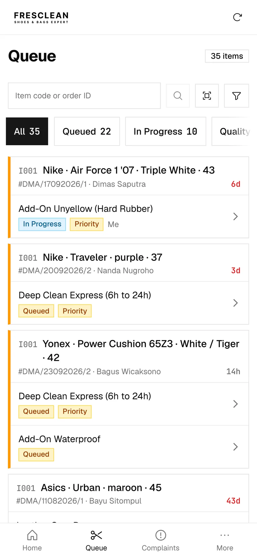
My first attempt let admins keep the side menu, because "fourteen destinations do not curate down to three." I reversed that. Home is the first tab for every role, and admins get a bar of their own. Couriers, it turned out, had no navigation on phones at all, which took a few more commits to fix.
Sliding the right way
Apps tell you where you're going with motion. Open a record and it slides in from the right, go back and it slides out. I added that with view transitions, where the browser takes a snapshot of the old screen and the new one and animates between them. The first version decided the direction from how deep the URL was. That meant every tab tap counted as going deeper, so switching from Home to Orders slid exactly like opening an order.
Now a screen only slides when it's the child of the one before. The router tags each navigation as push or pop, or leaves it untagged:
const isChildOf = (child: string[], parent: string[]) =>
  parent.length > 0 &&
  child.length > parent.length &&
  parent.every((segment, index) => child[index] === segment);

if (isChildOf(to, from)) return ["push"]; // /orders → /orders/482
if (isChildOf(from, to)) return ["pop"]; // /orders/482 → /orders
return []; // / → /orders: Home is a neighbour, not a parent
The CSS then picks the animation with :active-view-transition-type():
html:active-view-transition-type(push)::view-transition-new(root) {
  animation-name: fc-slide-in-from-right;
}
Anything untagged cross-fades. The slides are phones only, too. "Sliding is a phone gesture. On the counter machine the sidebar stays put and the page is a panel beside it, so every screen just cross-fades." And nothing slides at all for anyone who has asked their device to reduce motion, because the whole block sits inside a media query that only applies when prefers-reduced-motion is no-preference.
The back button needed a second try as well. It first linked to the parent page, so a cashier who had filtered the orders list lost the filters the moment they opened an order and came back. It now steps back through history. The loading screen took two tries too. The A grey placeholder shaped like the page, shown while the real content loads. that showed while the app started read as a broken screen, so it got proper margins. And for a page it didn't know yet, it drew three grey blocks, a guess at a layout that might not exist, so that became a spinner. "A spinner says the same thing without the lie."
Splash screens and fonts
iOS shows a launch screen while an installed app starts, but only if it's convinced the app is running Opened from the home screen in its own window, with no browser address bar.. It wasn't convinced, because I'd only set the unprefixed version of that meta tag, and iOS only reads the old prefixed one. The page now sets both:
<meta name="mobile-web-app-capable" content="yes" />
<meta name="apple-mobile-web-app-capable" content="yes" />
My list of devices also stopped at the iPhone 15, and a phone that isn't on the list gets no launch screen at all. The app now generates 60 of them, for every iPhone since the X and three iPad sizes, at build time. None are committed, and none are cached by the service worker, since that would add around 400 KB.
The fonts had the opposite problem. The service worker was caching about 100 KB of alphabets that no order screen would ever print, so the app now ships only the Latin subsets. That took the cached files from 2811 KiB down to 2717 KiB.
What I couldn't check
Some of this hasn't been tried on real hardware yet. The notch padding only kicks in once the app is installed, and I couldn't install it on a simulator from my laptop. The touch-only rules were easier, since the iOS simulator reports a touch screen properly and I could check them there. Chrome's device emulation couldn't have helped, because it reports a touch screen as having no touch points. I still have the notch padding and the touch rules marked as not verified on a real device.